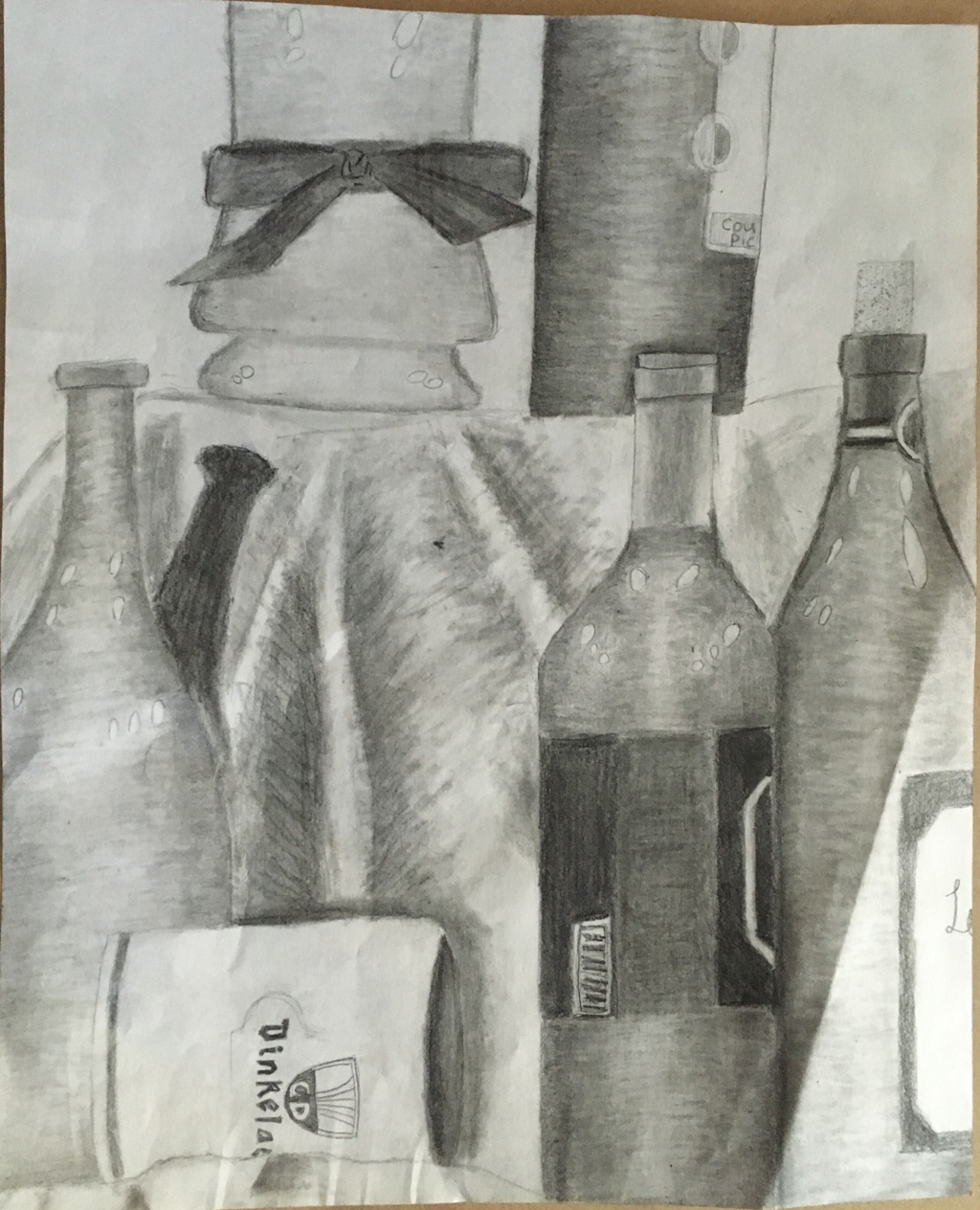
1. Describe how you arranged your composition. Discuss your use of the elements and principles. Is it a successful composition?
I arranged my composition by trying to include something to fill up the space is every area of the paper. I tried to use the same type of lines on all of the bottles so they would all look similar. I think the composition is lacking something in the upper right and left corners.
2. Did you use a wide range of values? (A range from white to black with at least 9 values). Explain how is this evident?
The piece has a good range of values, which is evident because you can count at least 9 values and there are some areas that are very dark while some are totally white. There are also not too many areas that have the same value.
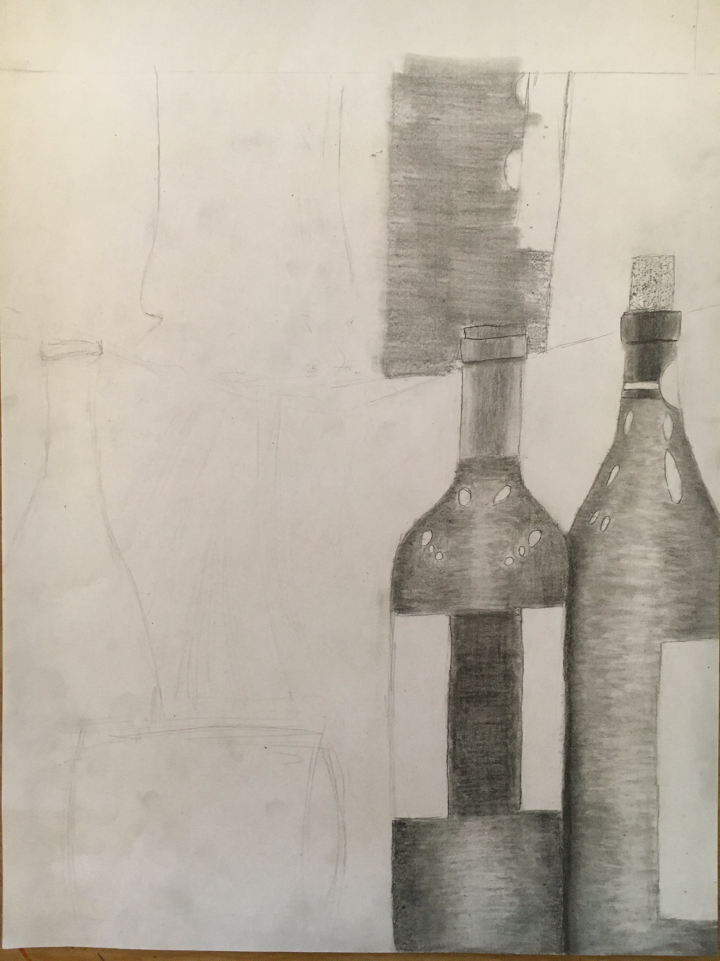
3. Explain how your knowledge and creating practice studies with value contributed to your piece.
Knowing and practicing shading of geometric shapes and doing a value chart helped when completing the final piece. It helped to practice making objects look three dimensional and where to place the highlights and shadows.
4. Describe the blending and transitions in your objects (discuss your use of pressure with pencil and other techniques to achieve this).
I used a lighter pencil to transition some of the values, and I also used a blending stump. A lot of blending is used on the bottles to make them seem round and have see through areas. The blending is also important to the fabric to create peaks and valleys.
5. Explain how your interpretation of texture is essential in capturing the look of the object.
The texture is essential for the fabric to appear realistic. The glass bottles need to have a smooth texture to accurately capture them. The ribbon also needs to have a smooth texture.
6. If you could recreate your pieces what would you do differently to enhance the final outcome?
If I could do this piece again I would pick a different composition that covers the entire page, or add a black background to contrast where there is empty space. I would also like to work on the opacity of the glasses more, and to make them appear clearer.
I arranged my composition by trying to include something to fill up the space is every area of the paper. I tried to use the same type of lines on all of the bottles so they would all look similar. I think the composition is lacking something in the upper right and left corners.
2. Did you use a wide range of values? (A range from white to black with at least 9 values). Explain how is this evident?
The piece has a good range of values, which is evident because you can count at least 9 values and there are some areas that are very dark while some are totally white. There are also not too many areas that have the same value.
3. Explain how your knowledge and creating practice studies with value contributed to your piece.
Knowing and practicing shading of geometric shapes and doing a value chart helped when completing the final piece. It helped to practice making objects look three dimensional and where to place the highlights and shadows.
4. Describe the blending and transitions in your objects (discuss your use of pressure with pencil and other techniques to achieve this).
I used a lighter pencil to transition some of the values, and I also used a blending stump. A lot of blending is used on the bottles to make them seem round and have see through areas. The blending is also important to the fabric to create peaks and valleys.
5. Explain how your interpretation of texture is essential in capturing the look of the object.
The texture is essential for the fabric to appear realistic. The glass bottles need to have a smooth texture to accurately capture them. The ribbon also needs to have a smooth texture.
6. If you could recreate your pieces what would you do differently to enhance the final outcome?
If I could do this piece again I would pick a different composition that covers the entire page, or add a black background to contrast where there is empty space. I would also like to work on the opacity of the glasses more, and to make them appear clearer.
 RSS Feed
